An interactive 3D heatmap made with WebGL & D3.
History
TLDR: I did a hackathon for a 3D data visualization app and didn’t get to finish an idea which is where the desire to make a “voxelgram” came from.
When I hear the words “3D data visualization” I immediately picture the awful 3D bar chart monstrosities which apps like Excel allow you to make. Something like this… 🤮
It doesn’t have to be this way! A while back Justin Slone, Erika Johnson, and I hacked together a 3D data visualization app on the Hololens we called “HoloViz” (code here). I can’t find our demo video, but from R Studio you could turn a dataframe into an Azure blob + QR code, scan that QR code with your HoloLens, and HoloViz would display a 3D visual like a scatter plot (point cloud) or a complex surface.
However, I didn’t get to implement an idea I had for a 3D heatmap.
Voxelgram
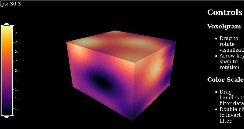
A demo is worth a million words, so here you go.1 The main visual is a set of cubes rendered in WebGL, and the “legend” on the left is really an interactive data selector implemented in D3. You can click and drag with the mouse to rotate the main visual how you want. By dragging the white “handlebars” you can filter out high or low values of the data.A You can also drag the entire box to filter to a certain range, or even double-click it to invert the filter.
Limitations, Ideas, Related Work
With the demo written I don’t feel terribly motivated to invest more time in it. However, for future me, or anyone else who might be interested in extending or improving this, I have some ideas for how it could be better.
- Re-write for performance. Currently implemented with a bunch of shaded geometry, which scales poorly. A better approach would be to render a single fullscreen quad and raytrace the scene, passing in the data as a texture. This project called voxeltastic appears to use this approach and has dramatically better performance than my demo. It also has some cool features like partial transparency of the voxels. However, that code appears to use a custom WebGL wrapper re-purposed from some other project which is IMHO difficult to follow and I’m not interested in unraveling it. Additionally, I think the filtering UI I’ve shown in my demo is better in that it doesn’t re-scale the colors in the visual as you filter data. I think a blend of voxeltastic’s rendering approach with my filtering interface would be really cool.
- Add axis labels that rotate with the chart.
- Enable slicing a plane (or range of planes) out of the cube. A cool idea would be to implement this with some more brush sliders. In other words, 4 brush sliders: one for the data values and one for the range of each axis.
- Animate through successive planes along any one dimension.
- UI to upload a custom dataset.
-
Screenshot in case the demo doesn’t work in your browser.
 ↩︎
↩︎